
 Discerning members and guests expect club websites to be more than just functional—they must also be attractive extensions of the properties themselves.
Internet users can be a fickle bunch. With endless options for entertainment and constant opportunities for distraction, users who happen upon a website that is either dysfunctional, unattractive or cumbersome to use are often quick to dismiss it and move onto something else.
Club properties that want to stay front-of-mind with members, while also presenting an attractive face for prospective members and guests, must create websites that are not only intuitive and easy to navigate, but dynamic and aesthetically pleasing. Otherwise, members—and prospects—may simply move on to more attractive options.
| SUMMING IT UP • Find visual ways to incorporate the look and feel of a club’s culture into its website, to give members and guests a taste of all that the club has to offer. • Establish consistent branding throughout a website by frequently including the club logo and a few distinctive fonts. • Training staff from each department to edit pages and information as needed can ensure that a website is consistently up to date. |
Building a Vision
When St. Andrews Country Club in Boca Raton, Fla., launched its redesigned website in February 2016, Kristen Pfeifer, Director of Communications & Member Services, had been carrying around a vision of how she wanted it to look for over a year.
In 2015, Pfeifer went to a technology conference where she saw a demonstration of parallax scrolling and immediately knew she wanted it for the club’s website. The web-design technique, in which video plays slowly (and silently) in the background with clickable foreground images, creates an illusion of depth in a two-dimension scene and adds to the feeling of immersion for the user—a concept Pfeifer was keen to incorporate in the St. Andrews site.
“We wanted to let prospective members know what it’s like to be a member here, so it was important to show member events,” she explains. “That’s the scariest thing for anyone joining a club. We have a mandatory membership in which you have to buy a home, so you have to be really committed to being a member. We want [our site] to give them a feel for the club, so when they go for a tour, they’re already familiar with what we have to offer.
“Everybody’s got golf, tennis, fitness, spa and dining [on their sites],” Pfeifer adds. “But real members doing real things is what makes [ours] different—that’s what we try to show.”
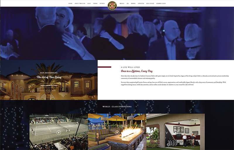
Kristen Pfeifer, Director of Communications & Member Services of St. Andrews CC, knew she wanted to implement parallax scrolling for the club’s new website as a way to showcase the membership in action. The technique incorporates background video (the blue image at the top of the photo above is moving video), with clickable items in the foreground.
To create the moving images on its site’s home page, St. Andrews hired a videographer to film club events over the course of three to four days and capture footage of the community. On interior pages, such as those that focus on the golf department or the club’s spa, which is currently being renovated, St. Andrews worked with the same company to create stand-alone videos in a clickable player, with voiceovers done by staff members. The videos are updated as changes to the facility are made, Pfeifer notes, such as the golf course’s recent renovation.
To build the website, St. Andrews worked with an outside supplier that provided the overall design and offered comprehensive training to staff members, with each department appointing a designated person to work on each portion of the website (as well as contributing to e-blasts).
“We can go in and quickly drop in a new video ourselves,” Pfeifer says. “We can change our headers or quickly add a page—the template is very easy to use.”
When redesigning the website, the first order of business was to determine which portions of the website were superfluous, and which sections saw the most activity and interest.
“We went through our previous website and pulled together statistics to see what members were using, and eliminated a lot of parts that few ever visited,” Pfeifer says. “The rules-and-regulations pages for each department were removed, and we found that the pages they visited the most were the ones with photos and videos, golf-tournament scores, the guest-pass form, or to see what’s on the menu tonight.”
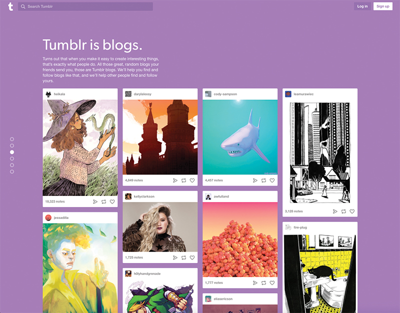 Popular blogging website Tumblr is one example of the “card design” layout, which creates a dynamic grid of images and text. Trending Looks Web design that is innovative and as close to real life as possible is always on-trend. Forbes Tech’s list of 2017 web-design trends included these popular new elements: Source: Forbes Tech |
Overall, Pfeifer says St. Andrews’ redesigned website incorporates far more visual elements than the previous design. Professional photography that shows the club in its best light, and which was on top on Pfeifer’s design priority list, has now been combined with a philosophy of keeping text to a minimum (nobody wants to read a book anymore, she notes) for a highly visual site that creates almost an infographic feel, she says.
Other elements that were important to include were an easy-to-navigate interface and quick functionality between tabs, so visitors don’t get impatient. Further, consistent branding should also be a high priority, Pfeifer says.
“I urge everyone to do strong branding throughout their website—using the same few fonts, and always putting the logo in the same spot,” she says. ”Paying attention to those things really goes a long way.”
In addition to its public-facing portion, St. Andrews’ website also features a members-only partition that offers a similar layout, but also includes a marketing section, with flyers and information about upcoming events, a member directory, and the ability to make a dining reservation. The website also has a real-estate component with a custom-built form base.
An employee-only section of the site features all staff healthcare forms and time-off requests. “Younger employees use the website for those documents a lot more than the older employees do,” Pfeifer notes.
With all of its moving parts, Pfeifer says one of the biggest challenges in running the new website is keeping it fresh. “As we start moving into the busy season, getting information posted on the site is so important,” she says. ”It’s great that employees can go in and quickly edit and make fixes, rather than waiting for a webmaster to do it for us.”
From the Ground Up
After Superstorm Sandy did significant damage to its clubhouse in 2012, Bay Head (N.J.) Yacht Club reopened a new facility in 2015. With it came a newly redesigned website that “fit well with the new style” of the clubhouse, says Communications Coordinator Casey Allocco.
Now featuring a wide, responsive view with higher-quality visuals rotating through the homepage, more white space, and a more modern look overall, the redesigned website is not as “box-like” as the previous version, Allocco says. And because it is used by members about as equally as by the public, according to the site’s analytics, a user-friendly, easy-to-navigate interface was of critical importance, she adds.

Bay Head YC redesigned and relaunched its website to coincide with the reopening of its clubhouse after Superstorm Sandy.
“The public can only access the main page, the events page, careers and a slight introduction to sailing,” Allocco says, noting that the facility is widely used for weddings and private events. “Because we are a private club and do not advertise, it’s important that the general public cannot gain too much access to information about our programs.
“It’s the way we’ve worked traditionally,” she adds. “If you want information, you need to go through a member. I think it allows for the membership to keep an exclusive lifestyle, and it deters the public from attending events.”
The most important element of Bay Head’s website is the calendar, Allocco says, noting that the website is the only place to see the events planned for the entire year. The club’s staff keeps the website updated on a weekly basis, which Allocco cites as the primary challenge of running it.
“There are so many pages and so much information, it’s tough to keep track of it all,” she says. “I can’t remember off the top of my head what needs updating, so I have to go through and look for it. It can be very time-consuming.”


Tell Us What You Think!
You must be logged in to post a comment.